
Square Barrels
Branding
Logo Design
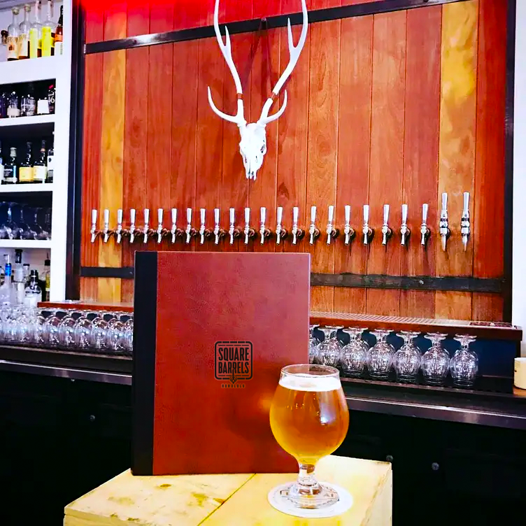
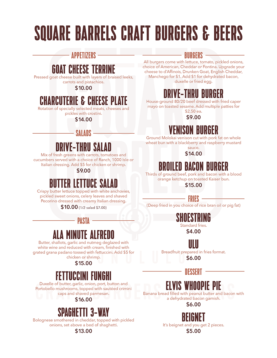
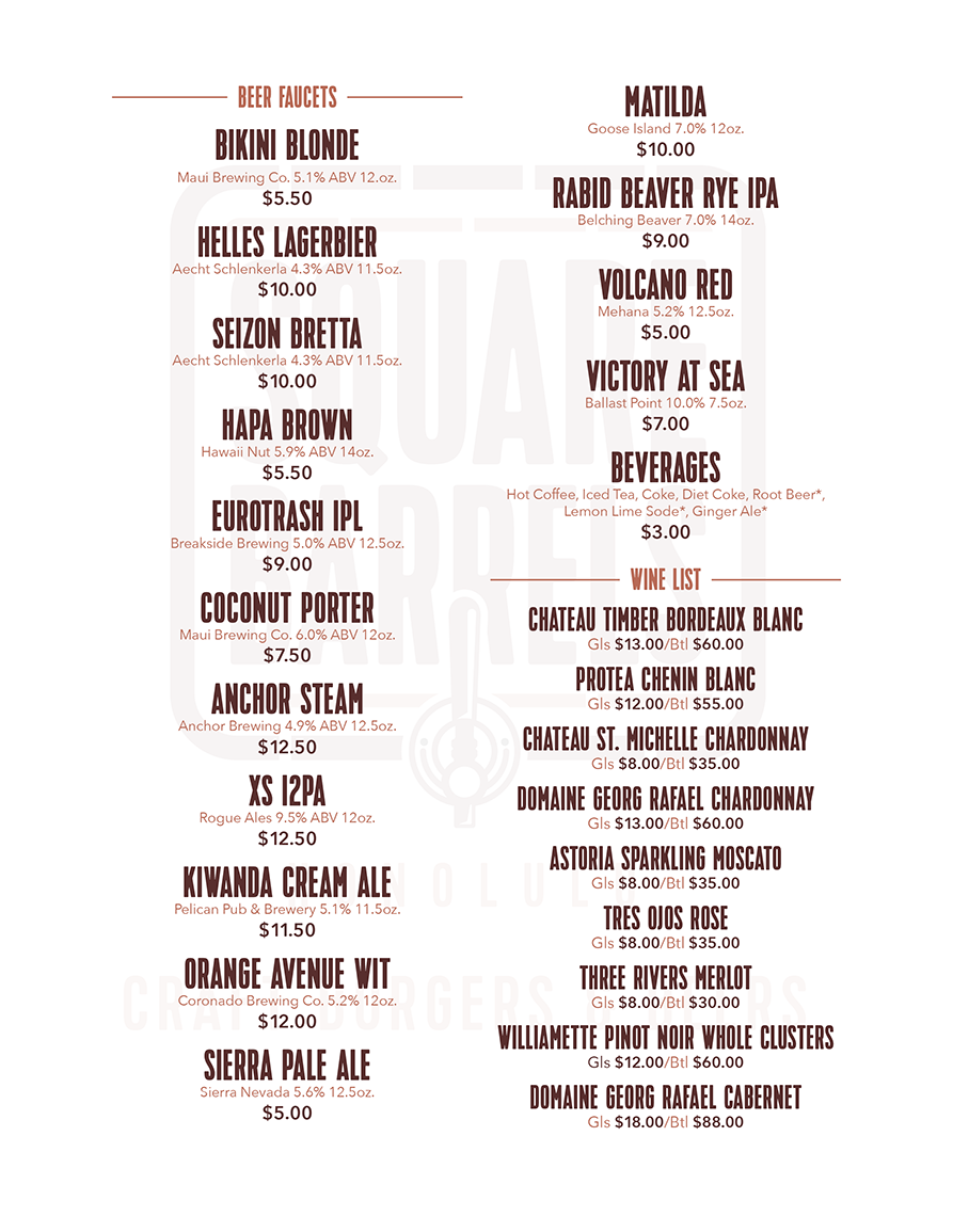
Menus
Apparel
Promotional
Project Summary
The project involves the creation of a captivating logo and comprehensive brand identity for the Square Barrels establishment. Drawing inspiration from the establishment's unique interior elements, the logo will seamlessly blend typography with subtle design elements that reflect the cozy ambiance and diverse menu offerings. The brand identity will extend beyond the logo, encompassing a cohesive color palette, typography choices, and visual motifs that resonate with the target audience seeking a dynamic yet comfortable dining and socializing experience.
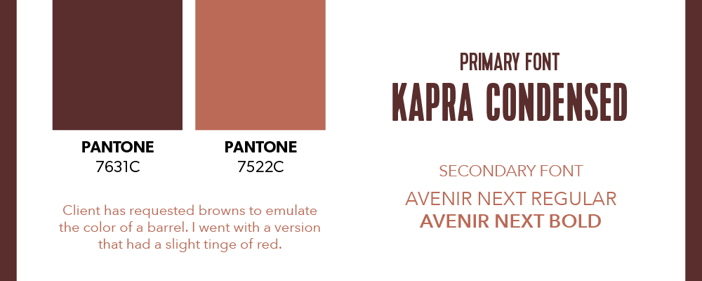
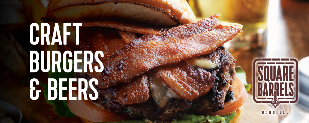
The client wanted a literal translation of the name into a working logo, which sounded easy enough but was quite the opposite. He wanted actual wood texture grains throughout the logo. I suggested for a more abstract simplified version where the shapes and lines would still be crisp at small sizes. Another hurdle was to incorporate a beer tap, being that they had 21 beers on tap. He was also very insistent on using browns.

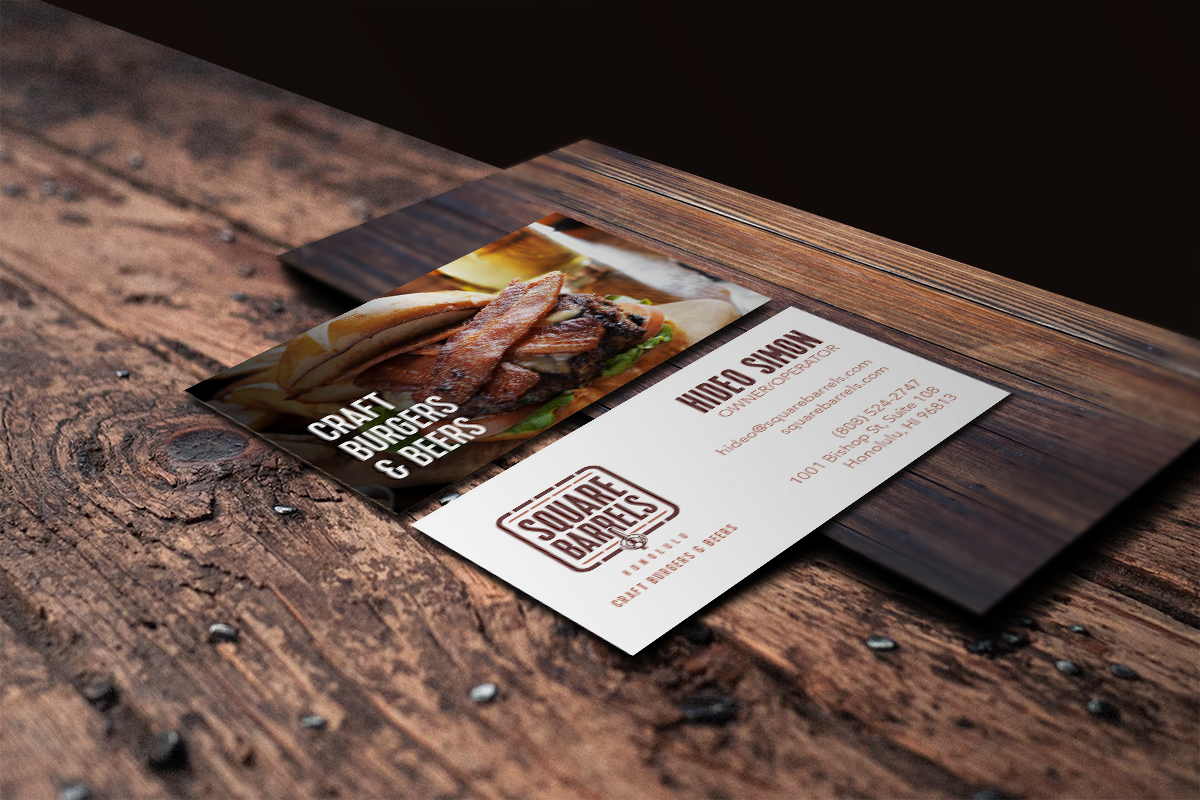
Two sided 3.5x2 business cards that carry over the brand's identity.
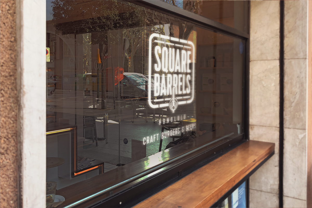
The client wanted something simple and easy to read with no imagery. Clean, simple and large bold typography with a subtle hint of the logo in the backdrop.
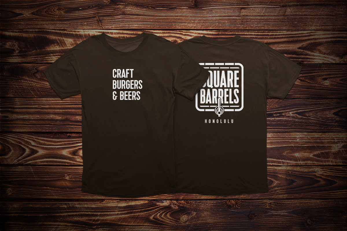
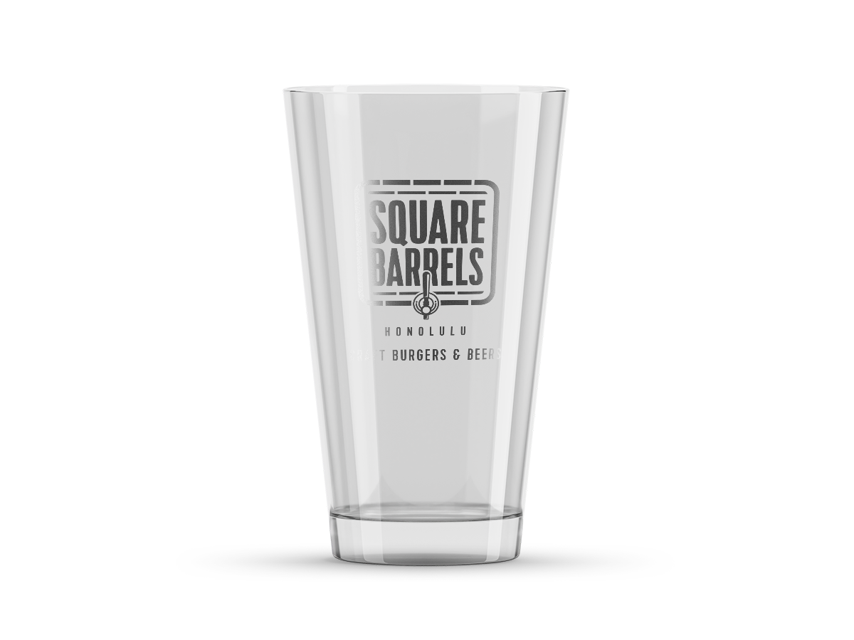
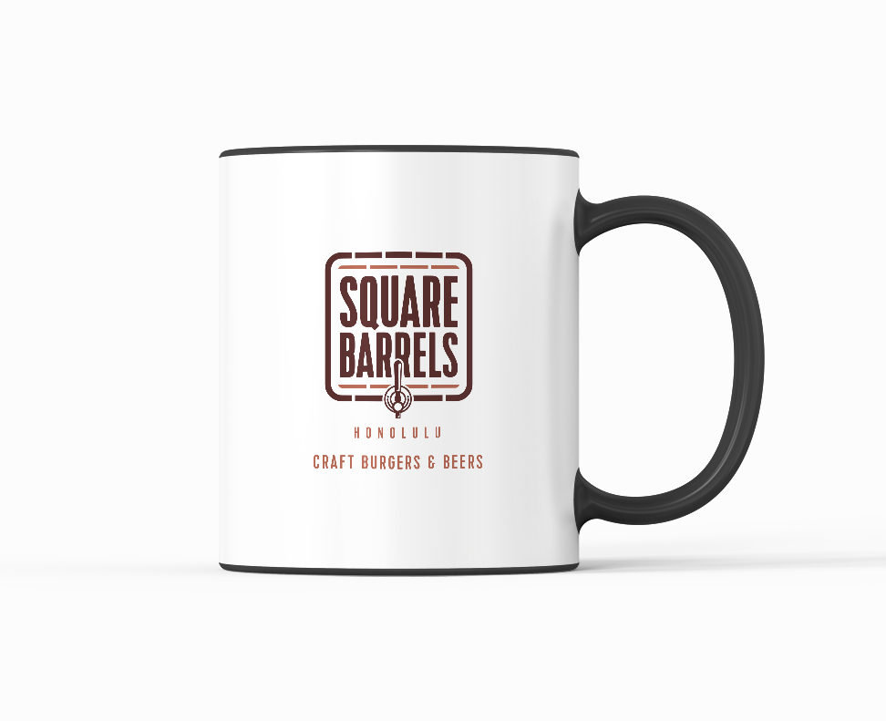
Apparel and promotional items with the brand's logo and slogan that further extend the brand's identity and overall cohesiveness.